
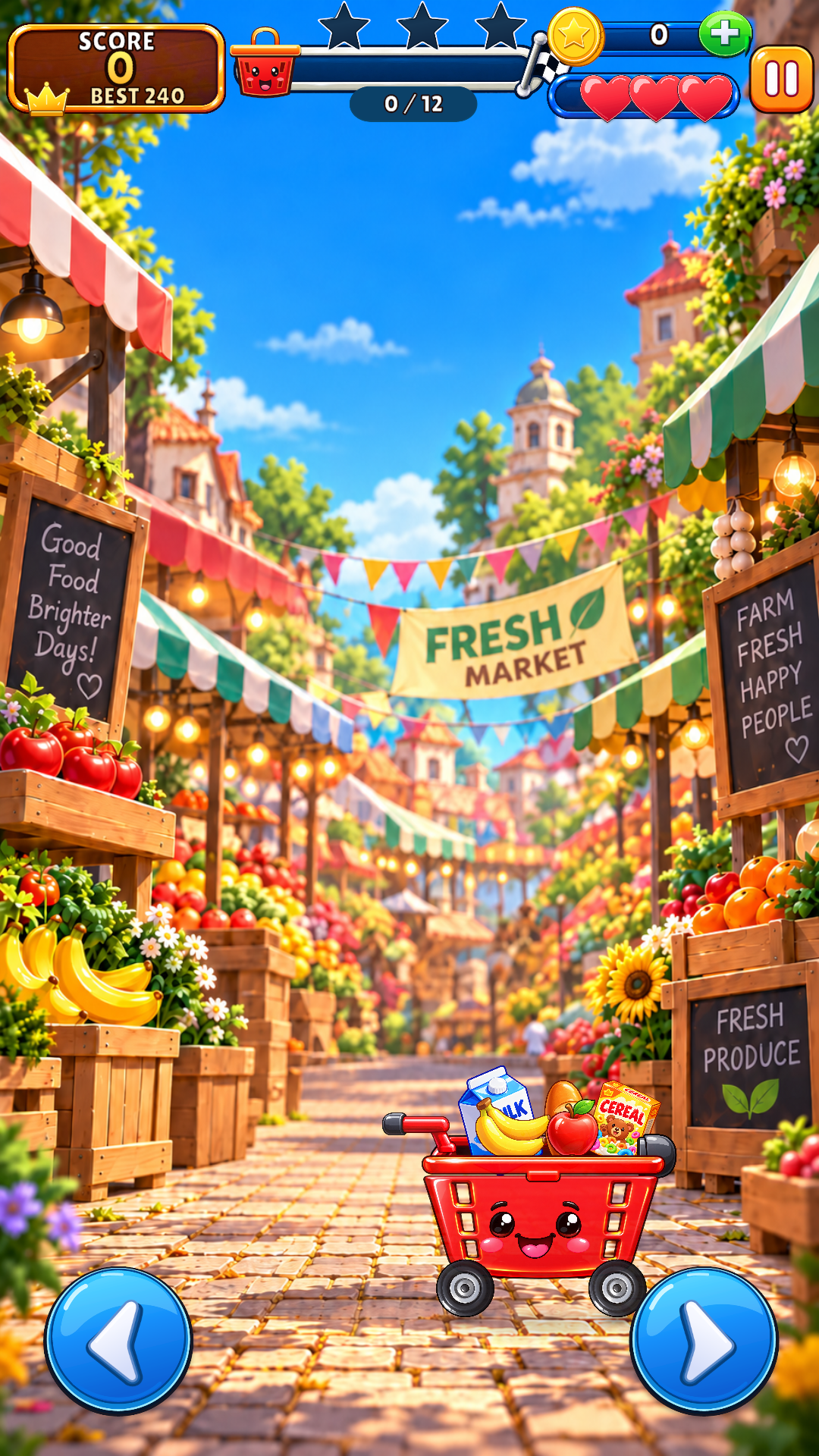
When we began shaping the Fresh Market world, the goal was not simply to create a background. We wanted a place with enough personality that players could imagine wandering through it after the round ended.
Start with a clear feeling
Our first direction was simple: a bright morning, a welcoming market, and the feeling that something fun is always about to happen. Warm wood, striped awnings, overflowing produce, flowers, flags, and glowing lamps created a friendly frame around the play area.
The center stays visually open. That quiet space is important because falling objects, hazards, and rewards need to remain readable against a detailed world.
Good game art does two jobs at once: it creates a mood and makes play easier to understand.
Depth without distraction
Large foreground stalls frame the action. Midground signs and market displays establish the location. Softer buildings, trees, and lights pull the eye toward the distance. Each layer has a job, and none should compete with the player’s basket or the next falling object.
A character at the center
The basket is more than a catcher. Its bright red shape, friendly face, little wheels, and lively reactions turn it into a companion. We kept its silhouette strong and its position stable so personality never interferes with control.
The interface belongs to the world
Wooden score plaques, glossy blue controls, golden rewards, and rounded shapes echo the market’s playful materials. The interface is bold enough to read instantly, while consistent outlines and highlights make every element feel as though it came from the same toy box.
What we learned
More detail does not automatically mean more life. The strongest scenes balance richness with breathing room. We repeatedly removed elements, adjusted contrast, and checked the game at phone size until every important object remained clear.
That balance—joyful atmosphere, readable play, and a characterful interface—is becoming an important part of how we approach every Laxion Studio game.